Hey guys, another illustration incoming. This time it's an illustration I did for Rick Court's blog. He spoke of the chestnut tree and how when it burnt down it was the start of Mohawk College, which ended up being built at the very same location. So this is my representation of this.
The tree and bird were made in Illustrator and background was created using different effects in Photoshop.
Spot illstrations are coming shortly.
Hope you enjoyed it.
Friday, February 26, 2010
Wednesday, February 24, 2010
Illustration Friday - Propagate
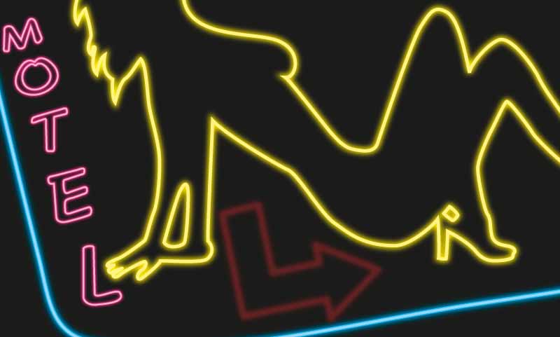
Hey guys, another illustration incoming. It's for Illustration Friday, again, and the topic was propagate, hard to not think about sexual activities on this one. Ofcourse being a 21 year old male, the ideas were... interesting. This being said, I had to follow my gut and decided to go with a "sleazy" motel sign kind of illustration. Here it is.
The woman was actually sketched almost two years ago now and was some fan art I did for "The Killers". I was reminded of the sketch and decided to go somewhere different with it digitally, and found a cool technique to mimic neon lights.
Well I actually have updated it a little to make it not so simple, added some more to the effect. Heres the updated file.
Hope you enjoy it.
Friday, February 19, 2010
Illustration Friday - Muddy
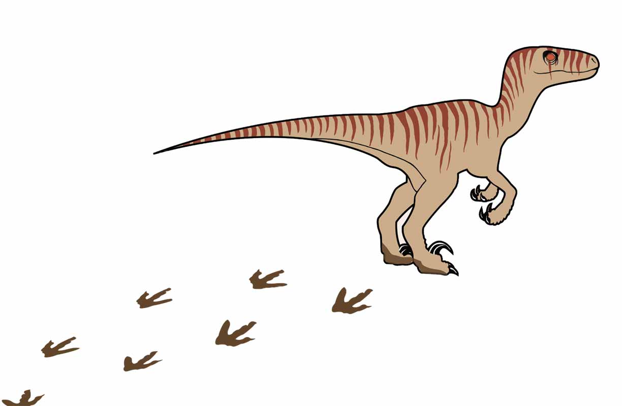
Hey guys, another illustration incoming. I had this illustration semi-completed for about a week now, simply got behind, caught up with a few things, but here it is.
The topic was muddy and I thought of a few topics to do it on, but nothing really peaked my interest. I have an old Jurassic Park poster laying around in my room, and when I was cleaning up I came across it, automatically turning my attention to dinosaurs. Kind of childish, but I love the topic so why not? Dinosaurs are ALWAYS muddy :).
The illustration was split between Illustrator and Photoshop and I was happy with the result.
Illustration Friday - Adrift
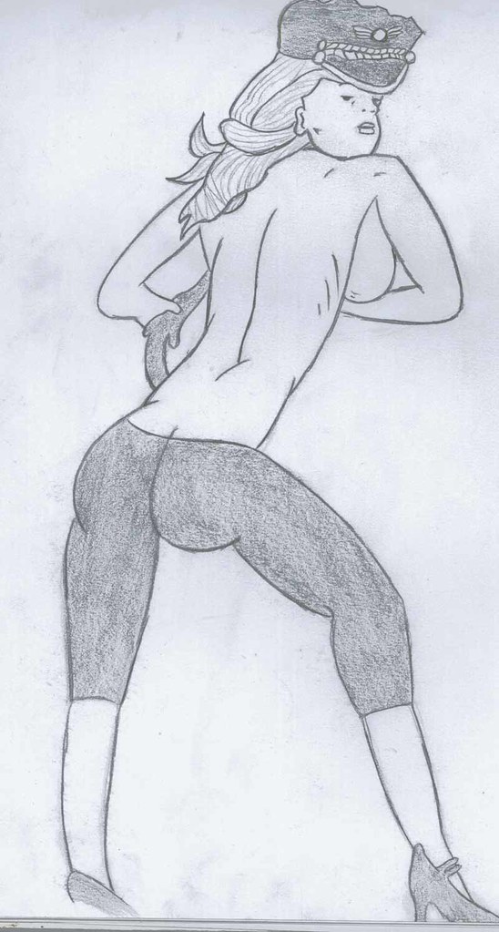
Hey guys, been a while since my last post, was a little behind. But here is this weeks entry for Adrift for Illustration Friday.
The idea started with the whole idea of afloat being on sea and such, and immediately I thought of sailors and eventually their tattoos. This pinup girl is on one of my favourite tshirts and I even in the future would like to get the original tattooed on my body somewhere. Originally drawn by an artist named SPRFKR.
I wasn't quite happy with the way it came out, but nonetheless I liked the idea.
Wednesday, February 3, 2010
Illustration Friday - Focused Michael Jordan
Hey guys, second post for the day. Just posting my newly created illustration, fully done on Illustrator. It was done for Illustration Friday, on the topic of focused, once again and it's a picture of one Michael Jordan's famous "posterizing" moments. When I was a kid I remember loving Michael Jordan's intensity, and thought who else better for the term focused. I am not as big of a fan of the sport, atleast on TV now, but love playing it and watching it live.
Anyway, here it is. Hope you enjoy it.
Panda Puff Cereal Advertisement
Hey guys, just a quick update. This is an advertisement idea I came up with while in Leif Peng's class. I had designed a cereal box last semester, and this semester we had to take the the cereal and target it towards a different age demographic. I was really inspired and automatically came up with the idea of evolution. The evolution of man was among my first thoughts, and I really enjoyed the idea of a panda evolving into a businesspanda.
Rough drawings are to come, just need to get them scanned, this will be edited soon.
Here was the colour comprehensive I created.
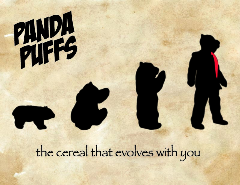
And then I created my own aged paper texture, simply using a piece of paper, a tea bag, and some curry.
This was my final, using the aged paper texture, doing some tweaks to the logo text, stylizing the logo text and adding a Kellog's logo.
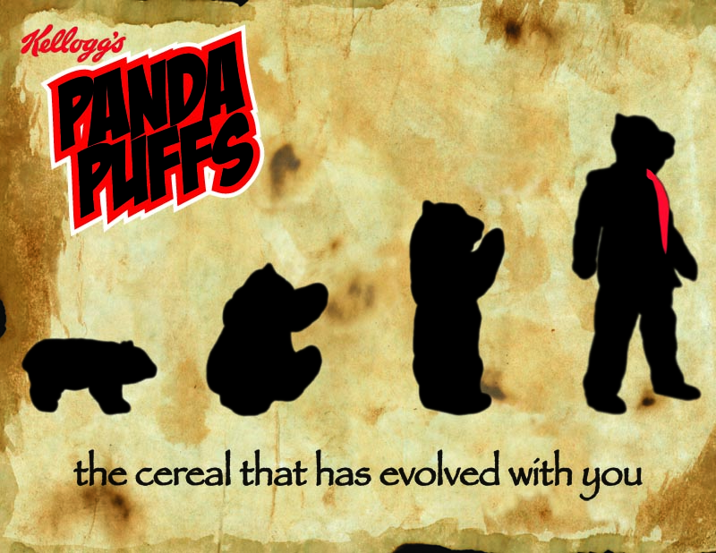
I hope you enjoyed the process, I was happy with the clever idea I came up with and the results.

Subscribe to:
Posts (Atom)